The main typeface is Arizona Sans (Dinamo), which we use as a universal functional font for headings and longer texts.
The font is primarily used in Regular (text, captions) and Bold (headings, highlighting), both main cuts also have special italic cuts for highlighting directly in the text or graphic representation of direct speech.
Regular (400)
Regular Italic (400)
Bold (700)
Bold (700)
Latin Extended-A
!
"
#
$
%
&
'
(
)
*
+
,
-
.
/
0
1
2
3
4
5
6
7
8
9
:
;
<
=
>
?
@
Ā
ā
Ă
ă
Ą
ą
Ć
ć
Ĉ
ĉ
Ċ
ċ
Č
č
Ď
ď
Đ
đ
Ē
ē
Ĕ
ĕ
Ė
ė
Ę
Ě
ě
Ĝ
ĝ
Ğ
ğ
Ġ
ġ
Ģ
ģ
Ĥ
ĥ
Ħ
ħ
Ĩ
ĩ
Ī
ī
Ĭ
ĭ
Į
į
İ
İ
IJ
ij
Ĵ
ĵ
Ķ
ķ
ĸ
Ĺ
ĺ
Ļ
ļ
Ľ
ľ
Ŀ
ŀ
Ł
ł
Ń
ń
Ņ
ņ
Ň
ň
ʼn
Ŋ
ŋ
Ō
ō
Ŏ
ŏ
Ő
ő
Œ
œ
Ŕ
ŕ
Ŗ
ŗ
Ř
ř
Ś
ś
Ŝ
ŝ
Ş
ş
Š
š
Ţ
ţ
Ť
ť
Ŧ
ŧ
Ũ
ũ
Ū
ū
Ŭ
ŭ
Ů
ů
Ű
ű
Ų
ų
Ŵ
ŵ
Ŷ
ŷ
Ÿ
Ź
ź
Ż
ż
Ž
ž
ſ
[
\
]
^
_
`
{
|
}
~
Special numbers and fractions
⓿
❶
❷
❸
❹
❺
❻
❼
❽
❾
⓪
①
②
③
④
⑤
⑥
⑦
⑧
⑨
½
⅓
⅔
¼
¾
⅕
⅖
⅗
⅘
⅙
⅚
⅛
⅜
⅝
⅞
Currency symbols
€
₤
₿
$
Whoop·de·doo Name
Whoop·de·doo
Whoop Dot (Unicode symbol MIDDLE DOT U+00B7, ·)
·
For the use of text styles in specific materials, the font size is defined by special rules and also in the respective templates. The following table is used to set the exact proportions between line spacing and font size, and possibly as a basis for text styles.
Use as few different text sizes as possible. As a rule, only a few text styles per document are sufficient. Use mainly left-aligned text in paragraph typesetting.
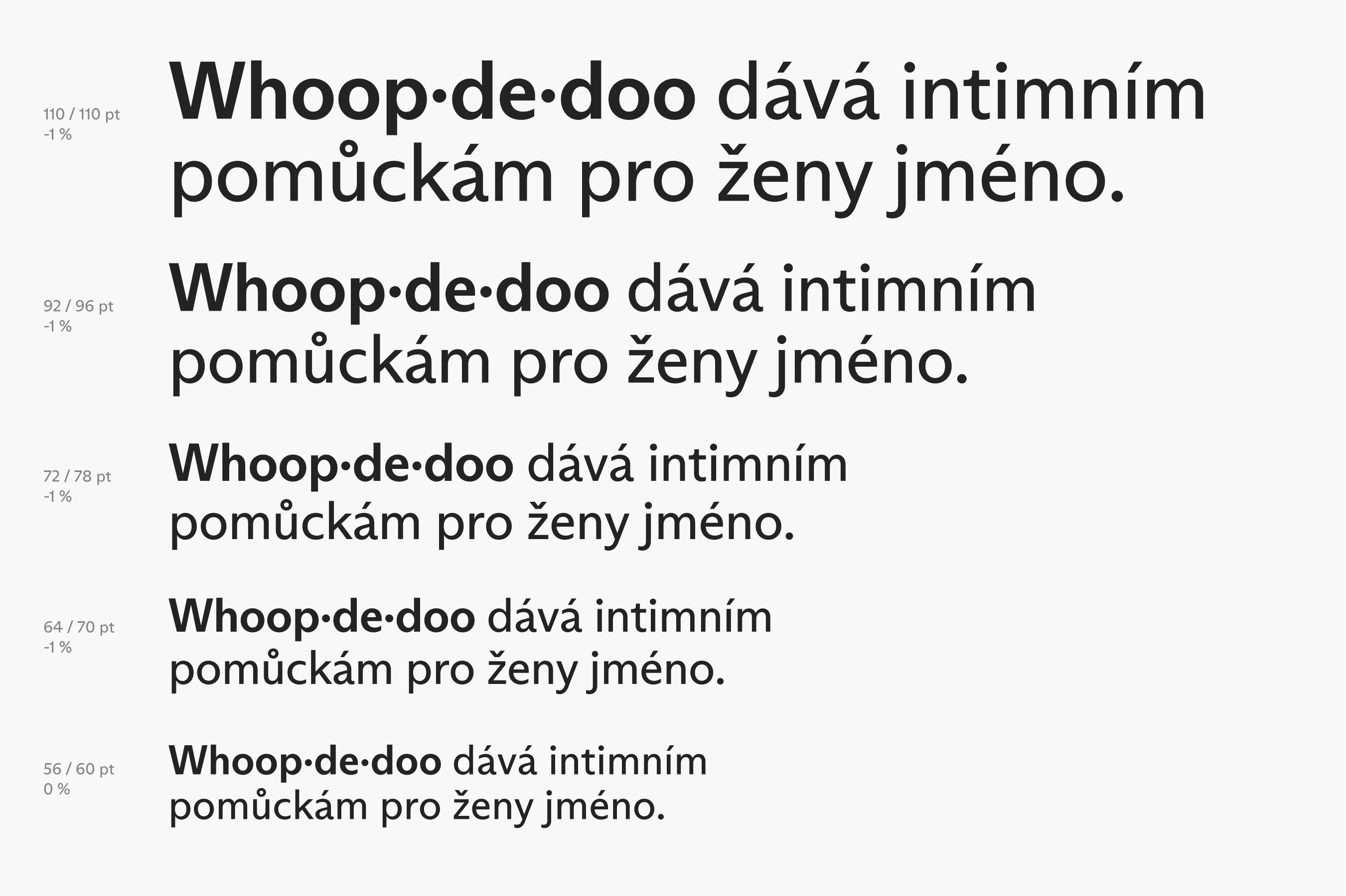
| Size (pt) | Line height | Letter spacing |
|---|---|---|
| 110 | 110 | -1 % |
| 92 | 96 | -1 % |
| 72 | 78 | -1 % |
| 64 | 70 | -1 % |
| 56 | 60 | 0 % |
| 48 | 52 | 0 % |
| 40 | 44 | 0 % |
| 36 | 40 | 0 % |
| 32 | 36 | 0 % |
| 28 | 32 | 0 % |
| 24 | 28 | 0 % |
| 21 | 25 | 0 % |
| 18 | 22 | 0 % |
| 16 | 20 | 0 % |
| 14 | 17 | 1 % |
| 12 | 15 | 1 % |
| 11 | 14 | 1 % |
| 10 | 12 | 1 % |
| 9 | 11 | 1 % |
| 8 | 10 | 1 % |
| 7 | 9 | 1 % |
| 6 | 8 | 1 % |
Arizona Sans is only licensed for use within the company, it is not allowed to be distributed or modified in any way, but the font can be sent, for example, to a printer as part of print files.
The .ttf, .woff and .woff2 files are for specific uses within print and web production, not for general use.
| Font installation - MAC | Font installation - PC | |
|---|---|---|
| ❶ | Download font files from Drive. | Download font files from Drive. |
| ❷ | Double-click the ".otf" file and select "install". | Right click on the ".otf" file and select "install". |
| ❸ | Voila! | Voila! |
If there is no option to use Arizona Sans, for example in Google Docs, we use Open Sans in the corresponding Regular and Bold cuts.
The Open Sans morphology is similar to Arizona Sans, but you need to use a special size range.
Regular (400)
Regular Italic (400)
Bold (700)
Bold Italic (700)
Latin Extended-A
!
"
#
$
%
&
'
(
)
*
+
,
-
.
/
0
1
2
3
4
5
6
7
8
9
:
;
<
=
>
?
@
Ā
ā
Ă
ă
Ą
ą
Ć
ć
Ĉ
ĉ
Ċ
ċ
Č
č
Ď
ď
Đ
đ
Ē
ē
Ĕ
ĕ
Ė
ė
Ę
Ě
ě
Ĝ
ĝ
Ğ
ğ
Ġ
ġ
Ģ
ģ
Ĥ
ĥ
Ħ
ħ
Ĩ
ĩ
Ī
ī
Ĭ
ĭ
Į
į
İ
İ
IJ
ij
Ĵ
ĵ
Ķ
ķ
ĸ
Ĺ
ĺ
Ļ
ļ
Ľ
ľ
Ŀ
ŀ
Ł
ł
Ń
ń
Ņ
ņ
Ň
ň
ʼn
Ŋ
ŋ
Ō
ō
Ŏ
ŏ
Ő
ő
Œ
œ
Ŕ
ŕ
Ŗ
ŗ
Ř
ř
Ś
ś
Ŝ
ŝ
Ş
ş
Š
š
Ţ
ţ
Ť
ť
Ŧ
ŧ
Ũ
ũ
Ū
ū
Ŭ
ŭ
Ů
ů
Ű
ű
Ų
ų
Ŵ
ŵ
Ŷ
ŷ
Ÿ
Ź
ź
Ż
ż
Ž
ž
ſ
[
\
]
^
_
`
{
|
}
~
Whoop·de·doo Name
Whoop·de·doo
Whoop Dot (Unicode symbol MIDDLE DOT U+00B7, ·)
·
For the use of text styles in specific materials, the font size is defined by special rules and also in the respective templates. The following table is used to set the exact proportions between line spacing and font size, and possibly as a basis for text styles.
Use as few different text sizes as possible. As a rule, only a few text styles per document are sufficient. In paragraph typesetting, we mainly use left-aligned text.
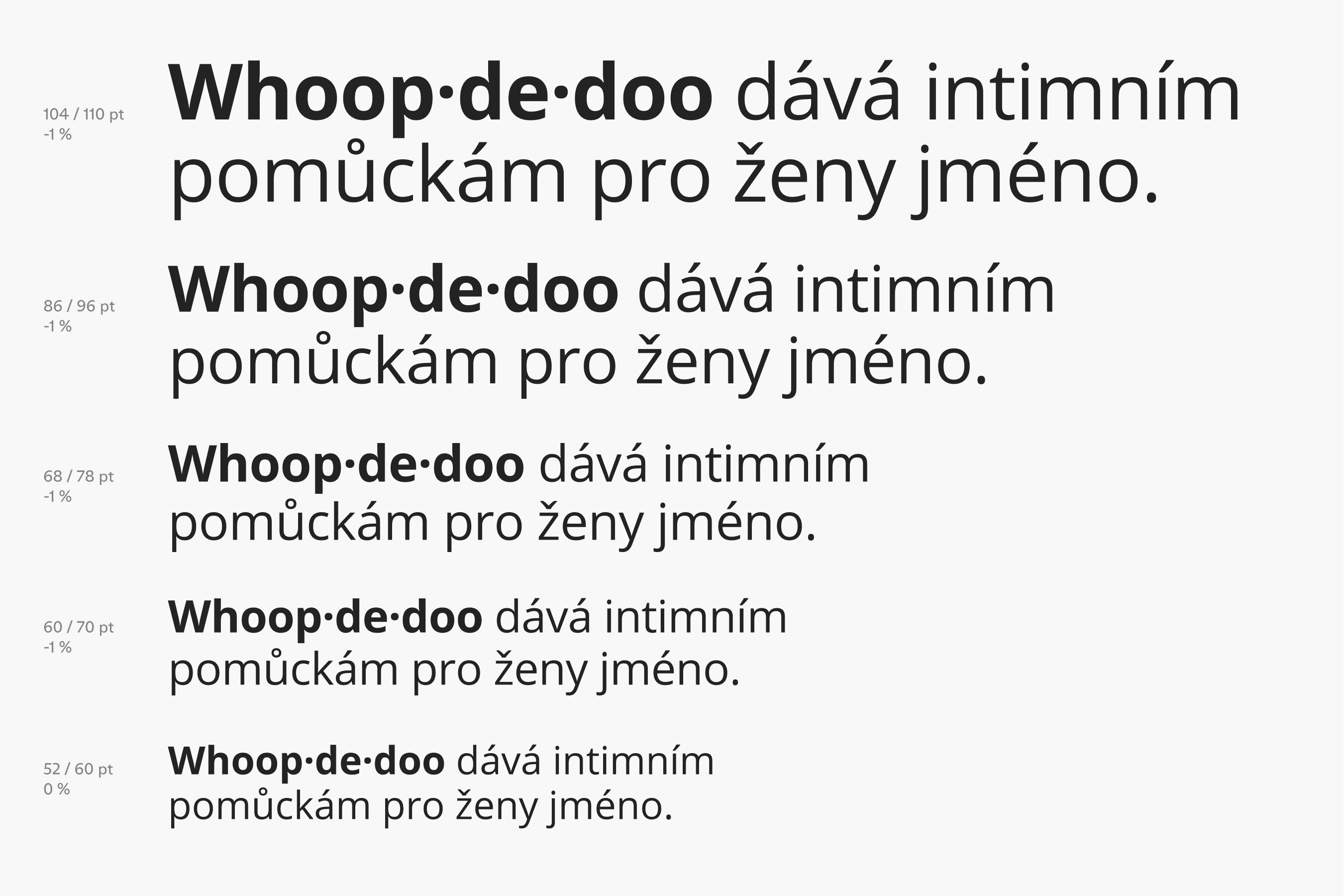
| Size (pt) | Line height | Letter spacing |
|---|---|---|
| 104 | 110 | -1 % |
| 86 | 96 | -1 % |
| 68 | 78 | -1 % |
| 60 | 70 | -1 % |
| 52 | 60 | 0 % |
| 44 | 52 | 0 % |
| 36 | 44 | 0 % |
| 32 | 40 | 0 % |
| 28 | 36 | 0 % |
| 24 | 33 | 0 % |
| 20 | 27 | 0 % |
| 19 | 26 | 0 % |
| 16 | 22 | 0 % |
| 14 | 20 | 0 % |
| 12 | 17 | 1 % |
| 11 | 15 | 1 % |
| 10 | 14 | 1 % |
| 9 | 12 | 1 % |
| 8 | 11 | 1 % |
| 7 | 10 | 1 % |
| 6 | 8 | 1 % |
Open Sans is an open source font with a free license to use.
The .ttf, .woff and .woff2 files are for specific uses within print and web production, not for general use.
| Font installation - MAC | Font installation - PC | |
|---|---|---|
| ❶ | Download font files from Drive. | Download font files from Drive. |
| ❷ | Double-click the ".otf" file and select "install". | Right click on the ".otf" file and select "install". |
| ❸ | Voila! | Voila! |
The alternate typeface is purely universal. This font is on every computer, and the information you type in this font is most likely to be displayed adequately to the recipient.
| Platform | Typeface |
|---|---|
| PC | Arial |
| MAC | Helvetica / San Francisco |
Table for orientation when it is appropriate to use the main, additional or alternate font. The given rules are based mainly on the licensing possibilities of the given fonts.
| Font usage | Main typeface | Additional typeface | Alternate typeface |
|---|---|---|---|
| Webdesign | |||
| Mobile apps | |||
| Marketing prints | |||
| Marketing on-line graphics | |||
| Offline documents | |||
| Shared online documents | |||
| E-mails |
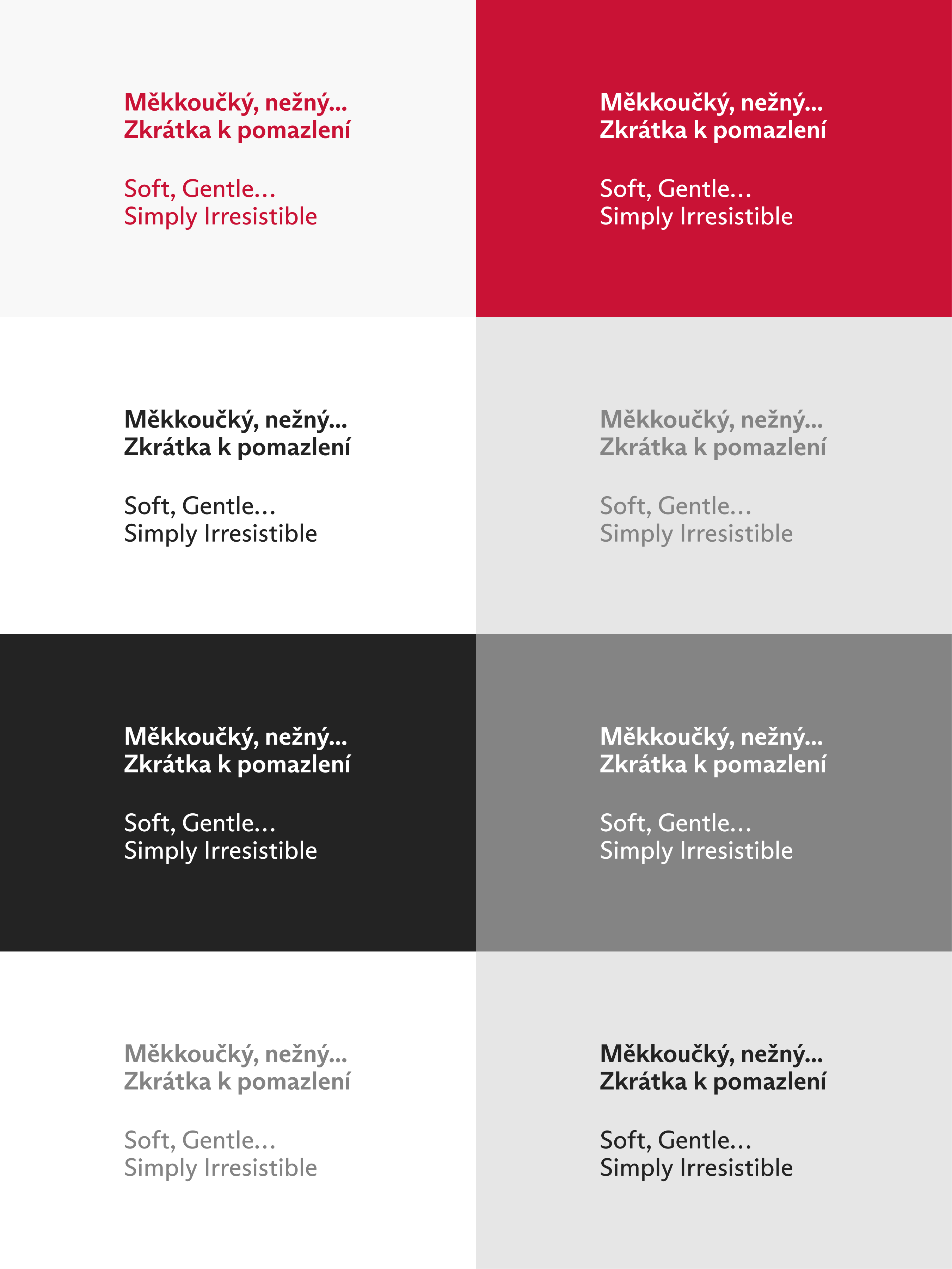
We recommend working with a basic font colour scheme similar to the relationship between the logotype and the background. The aim is primarily to provide sufficient contrast between the text and the background.
Especially in digital environments, we recommend using background colours for text messages in, for example, light greyscale, which will reduce the contrasting screen radiation.
The complementary colouring mimics the style of the material design (WDD tone on tone shades) with a low contrast of the text colour against the background. The material may include, for example, varnishing or embossing.
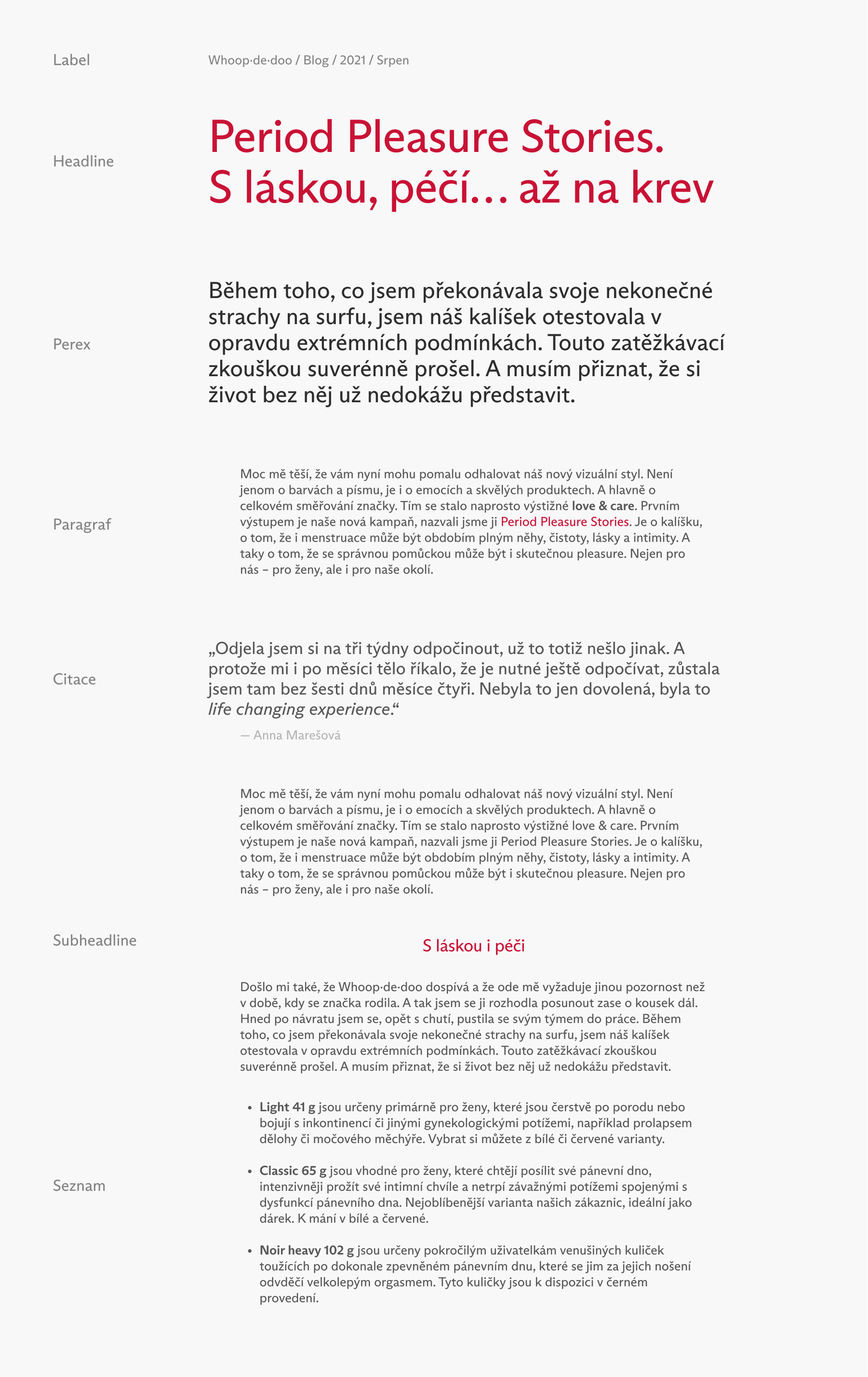
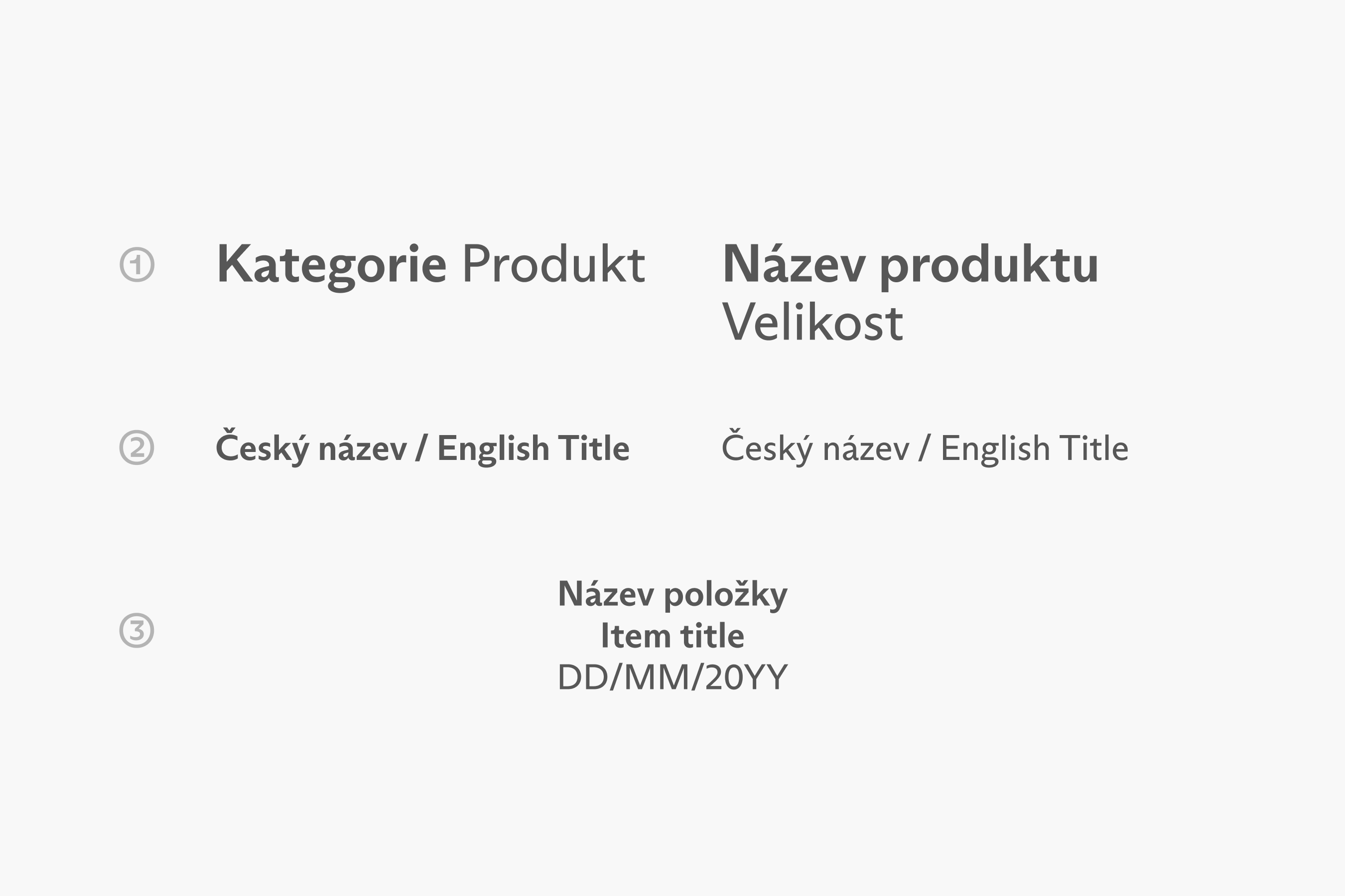
In typesetting, we recommend creating a clear hierarchy in the message with the use of colour, text size, font cuts, negative space and indentation. The following figure illustrates the most common typologies and the approximate overall feel of the typeface.
In the case of combinations of individual typefaces in the typesetting, it is recommended to maintain the levels of the message even in the hierarchy of the selected typefaces.
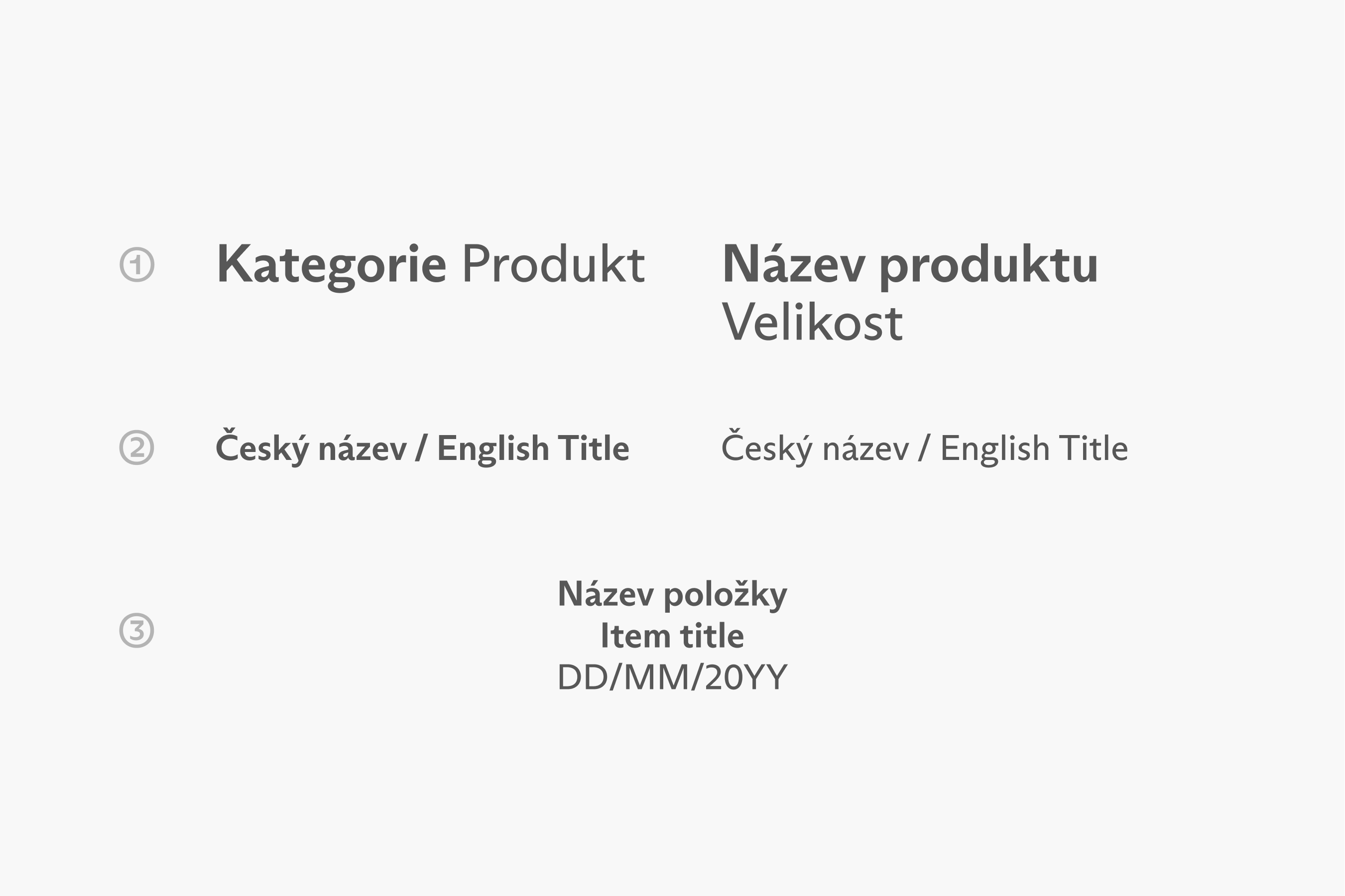
Differentiation of levels 1. by the thickness of the Bold and Regular cuts, 2. of bilingual messages by a slash with spaces in the text, 3. of bilingual messages by a new line with the next message level cut Regular.


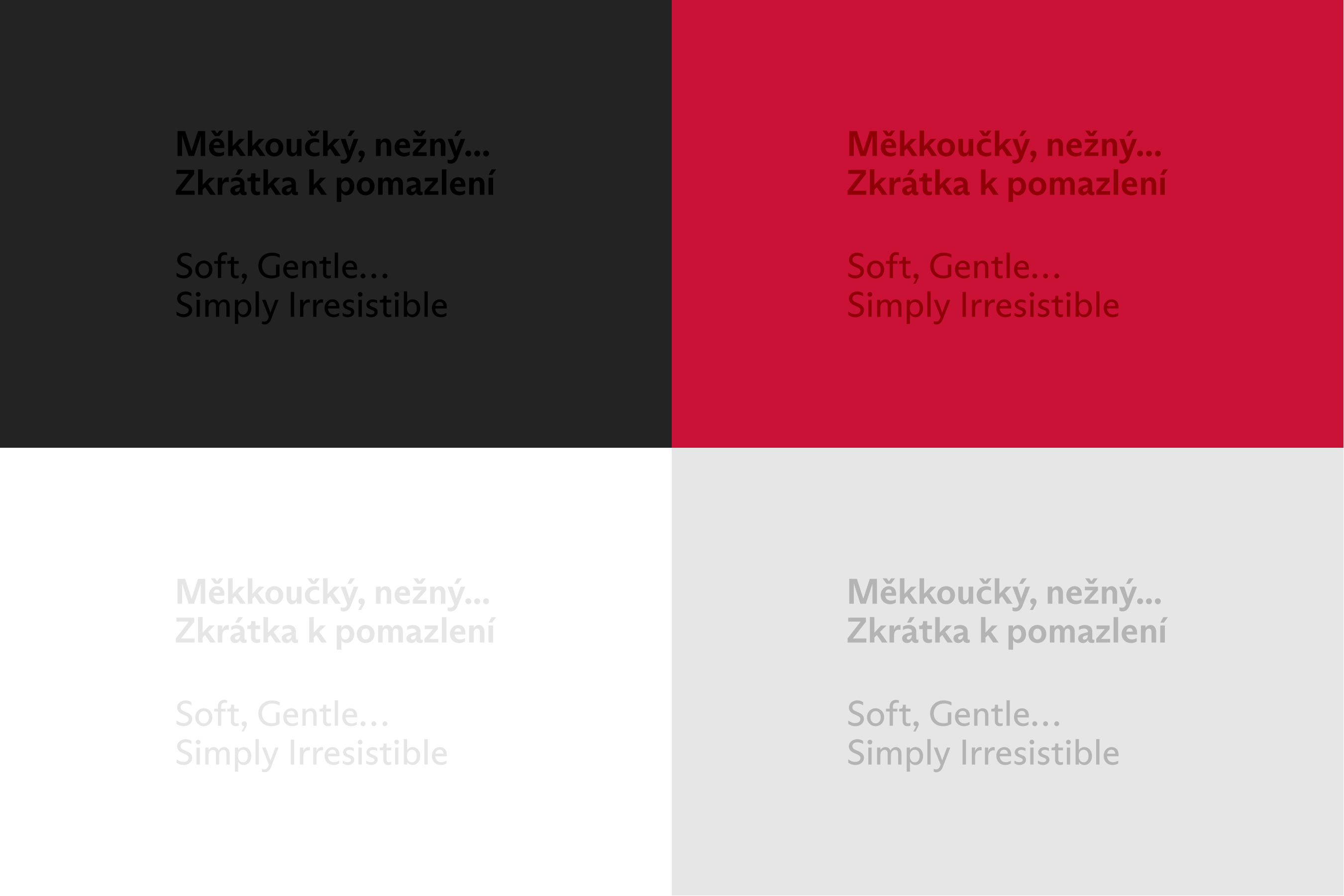
Important messages are highlighted with 1. a Bold cut, 2. an Italic cut of the same thickness if Bold is too distracting, 3. a contrasting colour to the background.
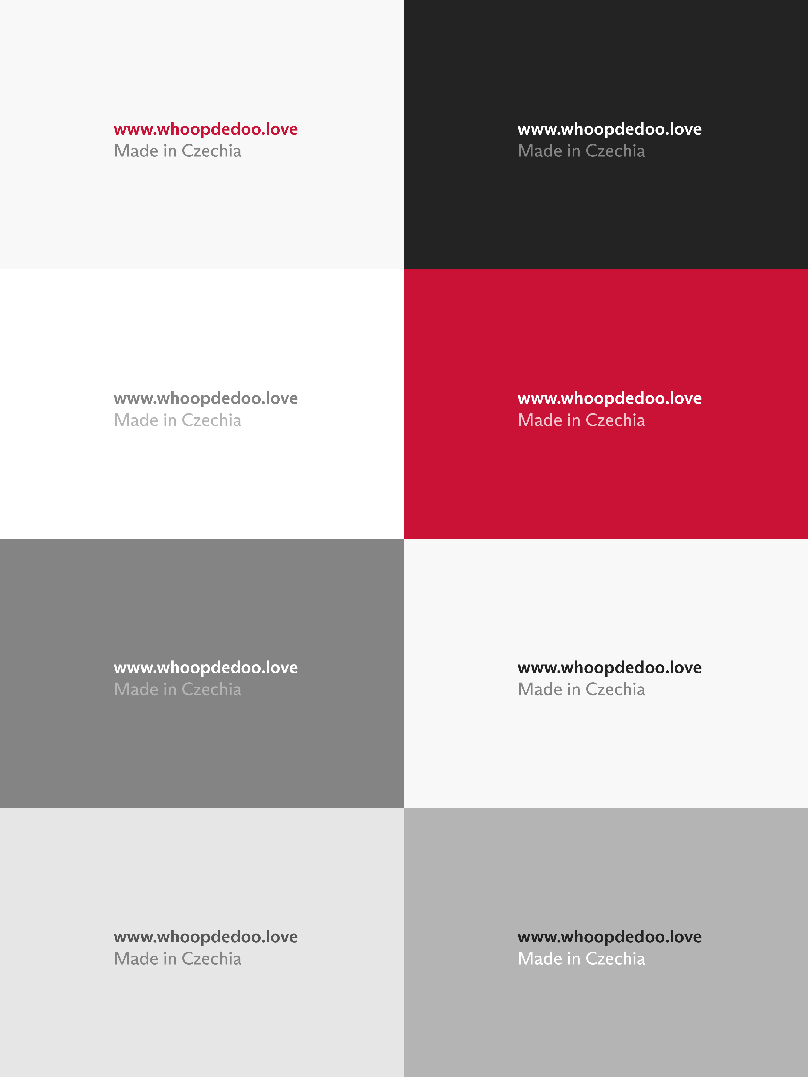
These contrasting text colours can also be used to differentiate the levels of the message between each other or to the background colour.
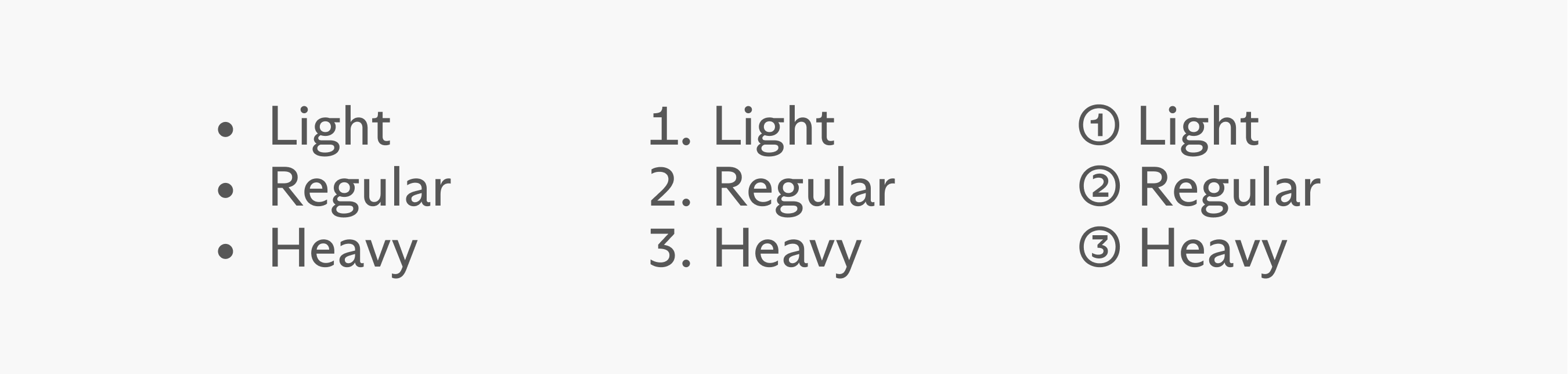
Three different options for creating lists, the last one is based on the OpenType symbols of the Arizona Sans Regular font.
It is possible to use text written in versals in the campaign name to differentiate it.