
Logo: WDD Red
Background: WDD White
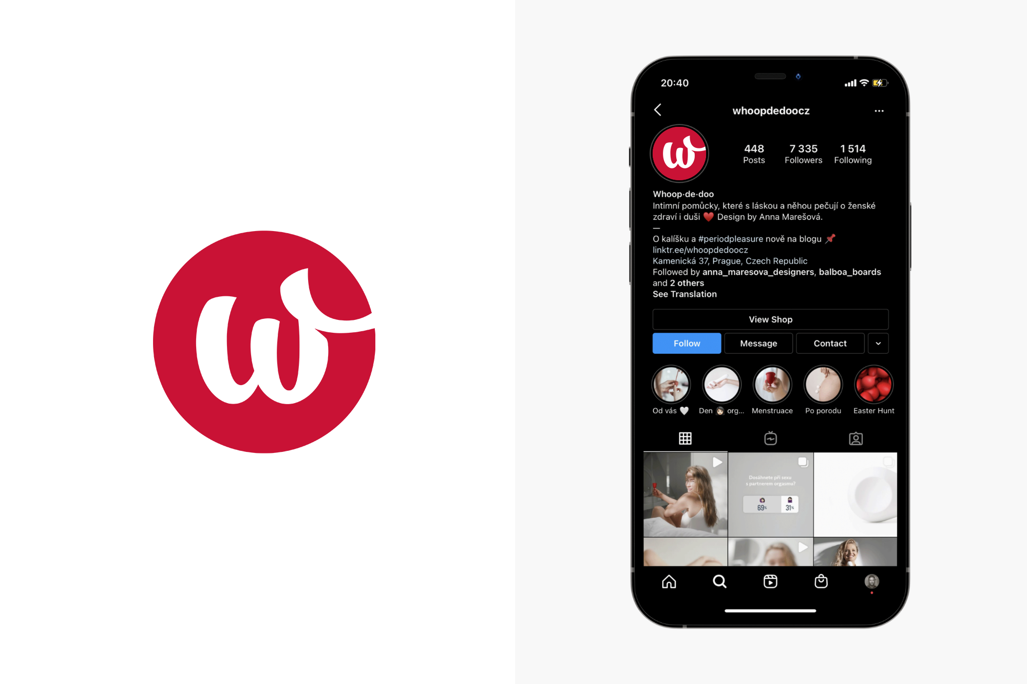
The symbol includes the letter "W" from the lettering logotype in a clear circle. Used when knowledge of the company name can be assumed or the company or product name is in a common area. For example, for product labeling and for social networking.
The same principles as for the logotype apply with regard to colour. The basic colour of the symbol is red (WDD Red) or it is also used in a negative (white) variant. The symbol can also be coloured in defined colours according to the desired style of graphic output.

By downloading a specific version of the logo (Screen Version vs. Print Version) straight away to get the relevant color of the logo for your use. The table shows a summary and the most common cases.
| Features and use of the logo | Version for screen | Version for print |
|---|---|---|
| Color mode of downloaded files | RGB | CMYKPantone |
| Recommended logo formats | PNGSVGPDF | EPSPDF |
| Web and presentations (PowerPoint, Keynote) | ||
| Online documents (Google, Office365) | ||
| Business card, flyer or brochure | ||
| Contracts and documents for printing |
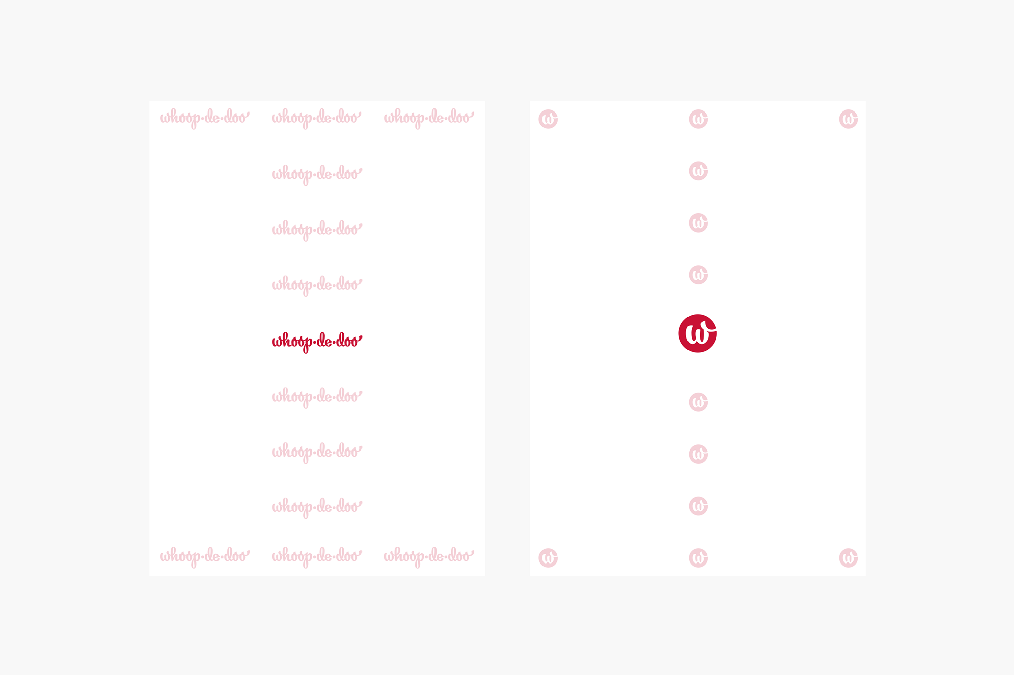
It is a space around the logo, where no surrounding graphic elements (logos, texts, images, page margins, etc.) must interfere so as not to disturb the brand. In most cases, the logo is in the surrounding context of other elements, from which it distances itself and differs due to the space of the protection zone.
The basic colour (WDD Red) is used when technologically possible and the mark is sufficiently legible (light shades and materials, saturation 0-10%).
The negative white version is primarily intended for coloured backgrounds, photographs and wherever other versions are not legible (darker shades, saturation 10-100%).When placing the mark on an image, we preferably use the white (negative) version.
On images with too light a background, we recommend placing a black shade with a transparency of 10-20% to maintain the legibility of the white mark.
Logo: WDD Red
Background: WDD White
Logo: WDD Red
Background: WDD White (off white)
Logo: WDD White
Background: WDD Red

Logo: WDD Black
Background: WDD Red
Logo: WDD White
Background: WDD Red (light hover)
Logo: WDD Red
Background: WDD Red (light hover)
Logo: WDD Black
Background: WDD White
Logo: WDD Black
Pozadí: Background: WDD White (off white)
Logo: WDD Black
Background: WDD Light Gray
Logo: WDD Black
Background: WDD Dark Gray (light hover)
Logo: WDD White
Background: WDD Dark Gray (light hover)
Logo: WDD White
Background: WDD Black
Logo: WDD White
Background: Photo
Logo: WDD Black
Background: Photo
The visual impression of the logo must be consistent. In order to achieve this, we follow these rules, which prohibit manipulation of the logo, especially in these ways.
Do not use shadows
Do not rotate logo
Do not recolor logo
Do not deform or change its original proportions of the logo
The logo and symbol are used in a limited number of locations in the formats to maintain consistency and avoid creating too large blocks of negative space in the overall area. The primary and secondary placement options on the format are always highlighted. Alignment to the vertical centerline or left corner is recommended.
Social media profile icons and website favicons are a square with a symbol. Social networks cut this square into a circle in some applications.
We recommend using a symbol with or without a white line around the perimeter (with a white background or transparent). We do not recommend using a combination of the symbol and the background photo in icons, as it may reduce readability.
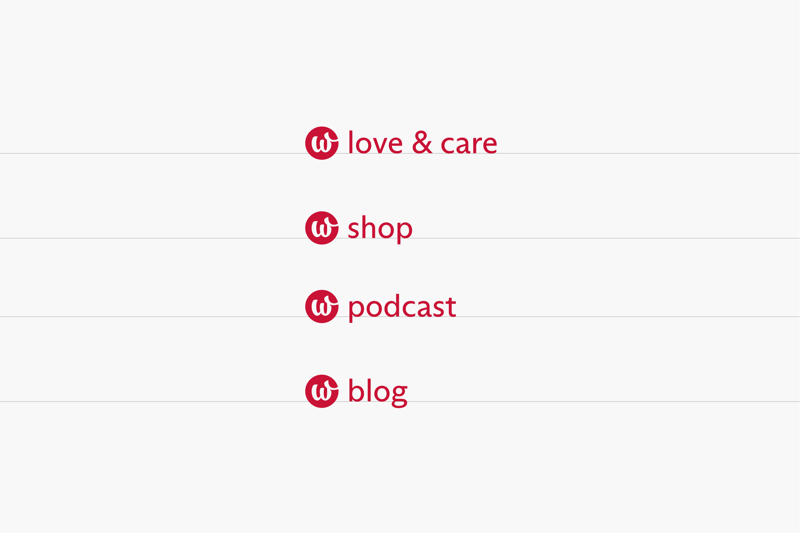
As the brand develops, there may be a need for complementary sub-brands and projects. Supplementary words are set in Arizona Sans Regular with an initial capital letter.
The font height is 2/3 the height of the symbol, the line is aligned to the bottom query of the W, and the indentation is defined as 1/4 the width of the symbol.
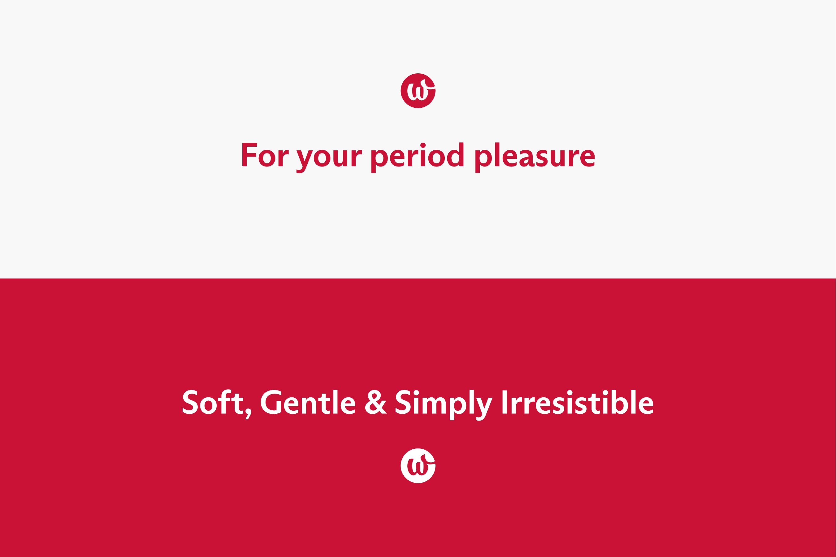
The symbol can be used with an additional message, for example as a key visual. The size proportions should correspond to the hierarchy of the message. The relative indentation then corresponds to the height of the symbol. The overall height of the symbol corresponds to 110 % of the height of the font on the line.
Additional text messages are set in Arizona Sans Bold font with kerning and line spacing set according to the size table.